

IT: Welcome to Derry season 2: Release details, cast news and plot details – Everything we know so far
Pennywise is far from finished with the town of Derry. Following a record-breaking debut that became one of the biggest...


Latest News
ALL NEWS → TECH
TECH TikTok launches ad free subscription plan in the UK for £3.99 per month
 FILM
FILM WATCH TRAILER: Matthew McConaughey returns in ‘The Rivals of Amziah King’ ahead of August release 12 hrs ago
 OTT
OTT Death Valley Season 2: Release date speculation, cast and plot details – Everything we know so far 12 hrs ago
 OTT
OTT The Unwanted Undead Adventurer Season 2: Latest updates on renewal status, release date, cast news and plot details 12 hrs ago
 WORLD
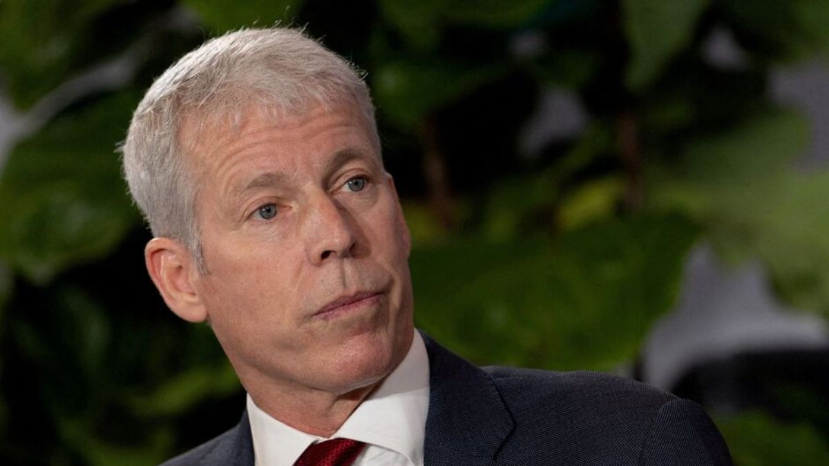
WORLD US Energy Secretary says Venezuela moving in right direction while Iran oil output falls 400,000 barrels per day
US Energy Secretary Chris Wright made fresh comments on Venezuela, Iran, and global energy developments as geopolitical tensions…
May 7, 2026


 GAMING
 Angry Birds enters World Video Game Hall of Fame nearly 15 years after global launch
The iconic mobile game Angry Birds is officially being inducted into the World Video Game Hall of Fame, marking a...
May 7, 2026


Why Coherent share price jumped over 13% today? Explained 13 hrs ago

US market today, May 11: Dow Jones slips 76 points while VIX volatility index jumps 6.46% 14 hrs ago

Agriculture commodities today, May 11: Tea jumps 16.39% in a day while cocoa surges 38.14% 14 hrs ago

Metals prices today, May 11: Silver explodes 161.49% yearly while lithium surges 202.24% 15 hrs ago


Microsoft Under Pressure in Europe Amid CLOUD Act Concerns May 7, 2026

Apple is planning a massive iPhone 18 delay: Here’s why! May 5, 2026

OpenAI raises $4 billion to push AI into businesses worldwide May 4, 2026

PlayStation 3 hidden feature lets users print photos and files even today May 3, 2026

GameStop plans bold eBay takeover bid as Ryan Cohen eyes massive retail expansion May 2, 2026
Lifestyle
MORE →
Energy price today, May 8: Crude oil at $95 and gasoline jumps 101% YTD May 8, 2026

Charli xcx set to attend Met Gala 2026 sparks fan excitement May 4, 2026

Casper the Friendly Ghost live action series in development at Disney Plus Apr 29, 2026


The impact of global news on oil trading decisions Apr 11, 2026

Why Brent Crude is used for inflation hedging Apr 11, 2026
Sports
MORE →
FIFA overhauls disciplinary regulations for 2026 World Cup to prevent player suspensions Apr 29, 2026

NFL media deals under scrutiny as Justice Department probes sports shift to streaming and ad revenue impact Apr 23, 2026

Ulberg claims UFC light heavyweight title with stunning first-round KO in front of Trump Apr 12, 2026


The Family Business Season 7 Release Date: When will new season drop? Here’s everything we know so far
The Family Business Season 7 has not been officially renewed or given a release date as of May 2026. Carl...
May 10, 2026
Geek Girl Season 2: Release details, cast news and plot details – Everything we know so far May 10, 2026

Murderbot Season 2: Latest updates on renewal status, release date, cast news and plot details May 10, 2026

Bad Monkey Season 2: Latest updates on release date, cast news and plot details May 10, 2026

M.I.A. Season 2: Possible release window, returning cast and plot details – Everything we know so far May 10, 2026

When does Mushoku Tensei: Jobless Reincarnation Season 3 Release? Everything we know so far May 10, 2026

When does Solo Leveling Season 3 Release? Everything we know so far May 10, 2026

The Institute Season 2: Latest updates on renewal status, release date, cast news and plot details May 10, 2026