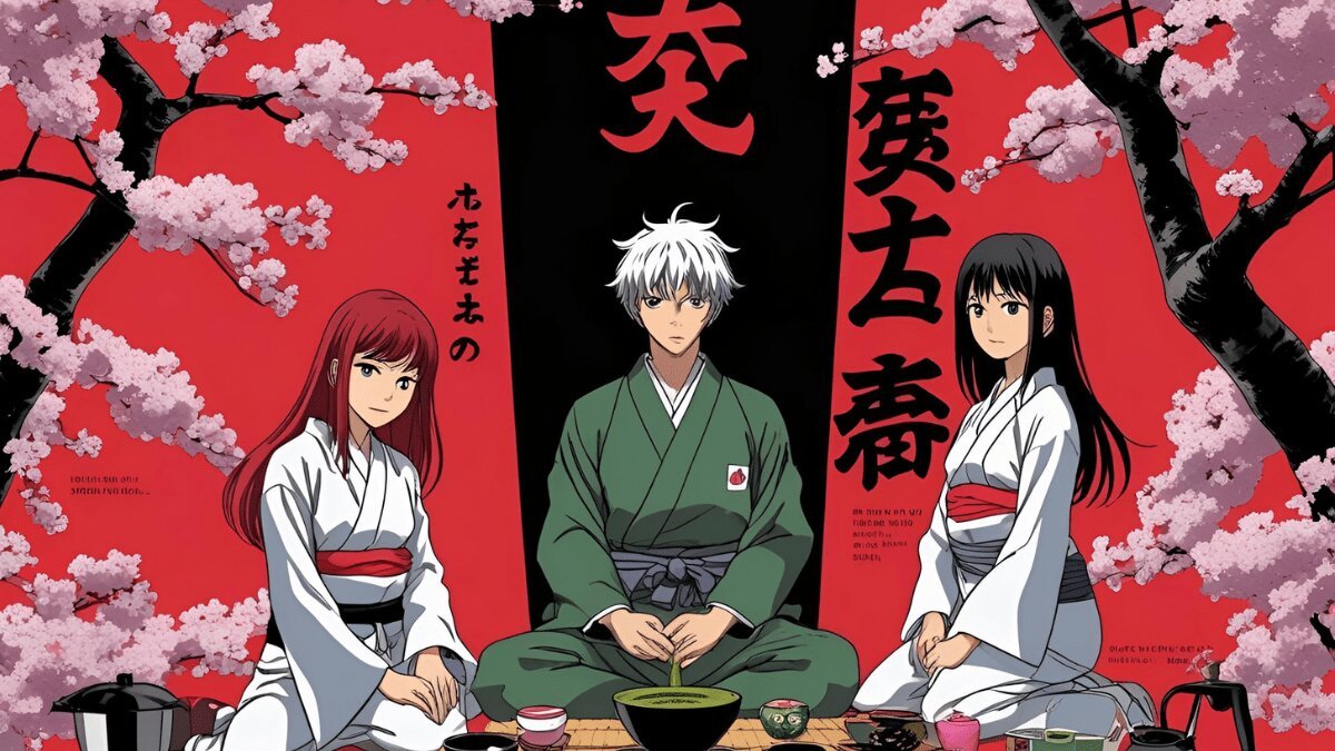
Colors speak before dialogue does. In anime and K-dramas, visual palettes are not just aesthetic choices but narrative tools, shaping how viewers experience emotions, worlds, and relationships. Anime bursts with neon shades—electric blues, fiery reds, and glowing purples—that transform ordinary landscapes into dreamscapes. From Tokyo’s cyberpunk nights in Akira to the supernatural glow in Demon Slayer, these colors electrify imagination, immersing audiences in surreal or heightened realities.
K-dramas, by contrast, invite audiences into softer atmospheres. Their muted pastels, creamy beiges, and warm lighting turn everyday streets, cafés, and homes into spaces of intimacy. Shows like Crash Landing on You or Reply 1988 use delicate palettes to root viewers in familiarity and nostalgia, reinforcing the emotional realism of their stories.
This clash of neon versus pastel is more than visual design—it’s cultural storytelling. Anime’s palette reflects a desire to stretch beyond boundaries, conjuring infinite worlds. K-dramas’ colors remind us of home, everyday tenderness, and small yet meaningful human connections. Together, they showcase how art direction defines tone, mood, and memory.
Anime’s Neon Universes
Anime thrives on exaggeration—not only in character design and storylines but also in its color palettes. Neon shades dominate futuristic cityscapes, supernatural battles, and otherworldly dimensions. Think of Akira’s glowing motorcycle trails or the cyberpunk brilliance of Psycho-Pass. These visuals heighten action and signal the extraordinary.
Neon also symbolizes freedom and rebellion. In Kill la Kill, vibrant reds and electric blues embody chaos and individuality. Meanwhile, Promare’s rainbow flames blur lines between destruction and beauty. Neon colors don’t simply decorate—they intensify emotion, signaling urgency, energy, or transcendence.
Even in lighter genres, anime uses neon strategically. Magical girl series like Sailor Moon or Madoka Magica bathe transformations in glowing light, dramatizing empowerment. These luminous colors connect the characters’ inner strengths to external spectacle, creating iconic, unforgettable moments.
Ultimately, anime’s neon palette captures imagination unbounded. It asks viewers to leave reality behind and embrace worlds where the extraordinary feels natural, where emotion itself radiates in glowing hues.
K-Drama’s Pastel Realism
K-dramas rely on the opposite approach. Their muted, pastel tones ground stories in realism, softening dramatic plots with visual warmth. Pale blues, blush pinks, and earthy greens make onscreen spaces feel lived-in and relatable.
In Reply 1988, retro palettes of muted yellows and browns evoke nostalgia, recreating the simplicity of childhood neighborhoods. Crash Landing on You frames romance through soft lighting and warm tones, turning even politically tense backdrops into gentle, intimate landscapes.
Pastels are particularly powerful in romance-centered plots. They symbolize tenderness and vulnerability, reinforcing the quiet intensity of stolen glances, unspoken feelings, or family bonds. While anime shouts in neon, K-dramas whisper in pastel—inviting audiences to reflect rather than react.
By keeping colors natural yet poetic, K-dramas preserve believability while layering emotional subtext. These palettes resonate with viewers who see reflections of their own lives in those cozy coffee shops or sunlit apartments.
The pastel world may seem simple, but it’s carefully constructed—every muted tone guides us toward empathy and relatability.
Beyond Color: What Palettes Reveal About Storytelling
The contrast between anime’s neon and K-drama’s pastels reflects deeper cultural storytelling traditions. Anime’s radiant, glowing hues emphasize fantasy, action, and the breaking of boundaries. Its colors say: anything is possible. K-dramas’ softer tones, meanwhile, emphasize intimacy, nostalgia, and emotional realism. Their message: beauty lies in the everyday.
This doesn’t mean the two mediums never overlap. Anime occasionally uses pastels in slice-of-life series like Your Name or Clannad, softening mood and realism. Likewise, K-dramas sometimes experiment with vivid hues in thrillers or fantasy romances, like Hotel Del Luna. But at their core, both forms rely on palettes to shape identity and expectation.
Color directs audience response as much as dialogue or plot. Neon accelerates adrenaline and awe. Pastels calm, soothe, and deepen reflection. Both choices tell us how to feel before words are spoken.
By analyzing color palettes, we see how cultural imagination is translated into visuals: Japan’s love for exaggeration and hyperreality, Korea’s preference for emotional subtlety and grounded beauty. Both approaches leave indelible marks on global audiences—making color not just aesthetic but narrative power.
Conclusion
The story of anime and K-drama isn’t just told through characters and dialogue—it’s painted in color. Neon-drenched anime worlds ignite imagination, turning cities into playgrounds for heroes, rebels, and dreamers. K-dramas’ pastel palettes, meanwhile, wrap us in warmth and tenderness, making ordinary spaces shimmer with meaning.
Colors are shortcuts to emotion. They bypass logic and tap directly into feeling, shaping how audiences perceive story. In anime, glowing neons stretch imagination to its limits, crafting fantastical spaces where passion and power literally radiate. In K-dramas, muted pastels preserve realism while magnifying intimacy, showing that love and meaning often live in the quietest details.
Neither approach is superior—they simply reflect different artistic and cultural sensibilities. Together, they show how visual storytelling can be as impactful as dialogue or plot twists. The brilliance of anime and K-dramas lies in their ability to make us feel not only through words, but through the very shades that color their worlds.


